Code 301 Reading Notes
hallo there i will sumorize for you some concepts that i learned from html-css book and JS book and How to Write a Git Commit Message from additional resources.
in the end there is a quiz for you and a map for our info. 💯
How the Web Works (visualization):
When you visit a website, the web server hosting that site could be anywhere in the world. In order for you to find the location of the web server, your browser will first connect to a Domain Name System (DNS) server.
Structure : its the page how its looks these are main pionts you need to understand :
- There are three types of HTML lists: ordered, unordered, and definition.
- Ordered lists use numbers.
- Unordered lists use bullets.
- Definition lists are used to define terminology.
- Lists can be nested inside one another.
Shay Howe’s intro to RWD
Responsive Overview:
responsive-web-designResponsive web design is the practice of building a website suitable to work on every device and every screen size, no matter how large or small, mobile or desktop. Responsive web design is focused around providing an intuitive and gratifying experience for everyone. Desktop computer and cell phone users alike all benefit from responsive websites.
The responsive web design term itself was coined, and largely developed, by Ethan Marcotte. A lot of what is covered in this lesson was first talked about by Ethan online and in his book Responsive Web Design, which is worth a read.
Responsive vs. Adaptive vs. Mobile:
For some the term responsive may not be new, and others might be even more acquainted with the terms adaptive or mobile. Which may leave you wondering what exactly is the difference between all of them.
Responsive and adaptive web design are closely related, and often transposed as one in the same. Responsive generally means to react quickly and positively to any change, while adaptive means to be easily modified for a new purpose or situation, such as change. With responsive design websites continually and fluidly change based on different factors, such as viewport width, while adaptive websites are built to a group of preset factors. A combination of the two is ideal, providing the perfect formula for functional websites. Which term is used specifically doesn’t make a huge difference.
Mobile, on the other hand, generally means to build a separate website commonly on a new domain solely for mobile users. While this does occasionally have its place, it normally isn’t a great idea. Mobile websites can be extremely light but they do come with the dependencies of a new code base and browser sniffing, all of which can become an obstacle for both developers and users.
Currently the most popular technique lies within responsive web design, favoring design that dynamically adapts to different browser and device viewports, changing layout and content along the way. This solution has the benefits of being all three, responsive, adaptive, and mobile.
example:
 ;
;
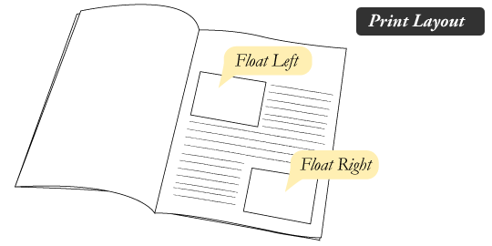
All About Floats :
Float is a CSS positioning property. To understand its purpose and origin, we can look to print design. In a print layout, images may be set into the page such that text wraps around them as needed. This is commonly and appropriately called “text wrap”. Here is an example of that.
example:
 this link will help you to practice:
float practice
this link will help you to practice:
float practice
Don’t Overthink It Grids:
The vast majority of websites out there use a grid. They may not explicitly have a grid system in place, but if they have a “main content area” floated to the left a “sidebar” floated to the right, it’s a simple grid.
If a more complex layout presents itself, people often reach for a grid framework. They assume grids are these super difficult things best left to super CSS nerds. That idea is perpetuated by the fact that a lot of the grid systems they reach for are very complicated.
example :
A block level element is as wide as the parent it’s inside (width: auto;). We can think of it as 100% wide. The wrapper for a grid probably don’t have much to do with semantics, it’s just a generic wrapper, so a div is fine.
<div class="grid">
  <!-- 100% wide -->
</div>
CSS Floats Explained By Riding An Escalator :
If you have ever jumped on an escalator, then you can quickly understand floats.
Your <div>is almost perfect. You decide to introduce some floats to fix the relationship between a few elements.
The next thing you know, your newly floated elements jump out of your carefully chosen order, and stick to the side of your div like a magnet. The phrase “unintended behavior” comes to mind.
I’ve personally spent hours trying to fully understand floats. I’d read an article and say, “Oh, this makes sense!” Then I’d return to my code, try it out and… fail. Back to the drawing board.
I’m going to do my best to spare you this fate.
Floats create alternate flows. This is the hardest part to understand. And once you introduce them, you then need to write your code so that it accounts for up to three flows: normal, left and right. This is a whole new set of rules, as opposed to manipulating the width of elements or their positioning.
Actually, floats are pretty similar to the dynamics of riding an escalator, and I am going to show how they can be used alongside the clear property to create crystal-clear relationships within divs. This way, the next time you try to use floats in your code, you won’t encounter any surprises.
SMACSS :
SMACSS (pronounced “smacks”) is more style guide than rigid framework. There is no library within here for you to download or install. There is no git repository for you to clone. SMACSS is a way to examine your design process and as a way to fit those rigid frameworks into a flexible thought process. It is an attempt to document a consistent approach to site development when using CSS. And really, who isn’t building a site with CSS these days?!
for more: smacss
Cheats sheet :
Markdown is a way to style text on the web. You control the display of the document; forma ing words as bold or italic, adding images, and creating lists are just a few of the things we can do with Markdown. Mostly, Markdown is just regular text with a few non-alphabetic characters thrown in, like # or *.you just need to make a file with .md extension on Vs code and good to go with this cheats sheet:
HEADERS :
    # This is an <h1> tag
    ## This is an <h2> tag
    ##### This is an <h6> tag
list :
     orderd:
         1. Item 1
         2. Item 2
         3. Item 3
     unorder:

         * Item 3a
         * Item 3b
EMPHASIS :
*This text will be italic*
_This will also be italic_
**This text will be bold**
__This will also be bold__
*You **can** combine them*
BLOCKQUOTES :
> I’ve always been more interested
> in the future than in the past.
I’ve always been more interested in the future than in the past.
LINKS:
http://github.com - automatic!
[GitHub](http://github.com)
IMAGES :

Format: 
table :
First Header | Second Header
----------- | -------------
Content cell 1 | Content cell 2
Content column 1 | Content column
emoji! :
:+1: :sparkles: :camel: :tada:
:rocket: :metal: :octocat:
for more info : markdown cheats
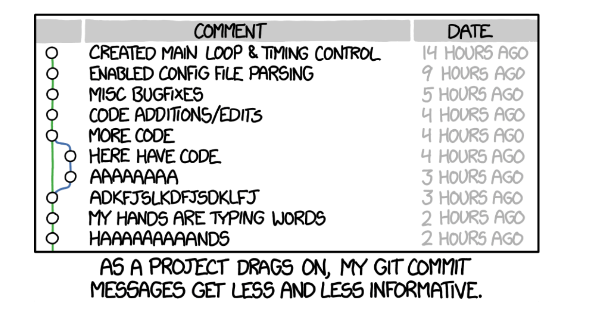
The seven rules of a great Git commit message:
- Keep in mind: This has all been said before.
- Separate subject from body with a blank line.
- Limit the subject line to 50 characters.
- Capitalize the subject line.
- Do not end the subject line with a period.
- Use the imperative mood in the subject line.
- Wrap the body at 72 characters.
- Use the body to explain what and why vs. how.
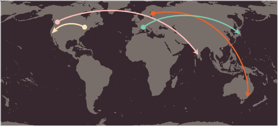
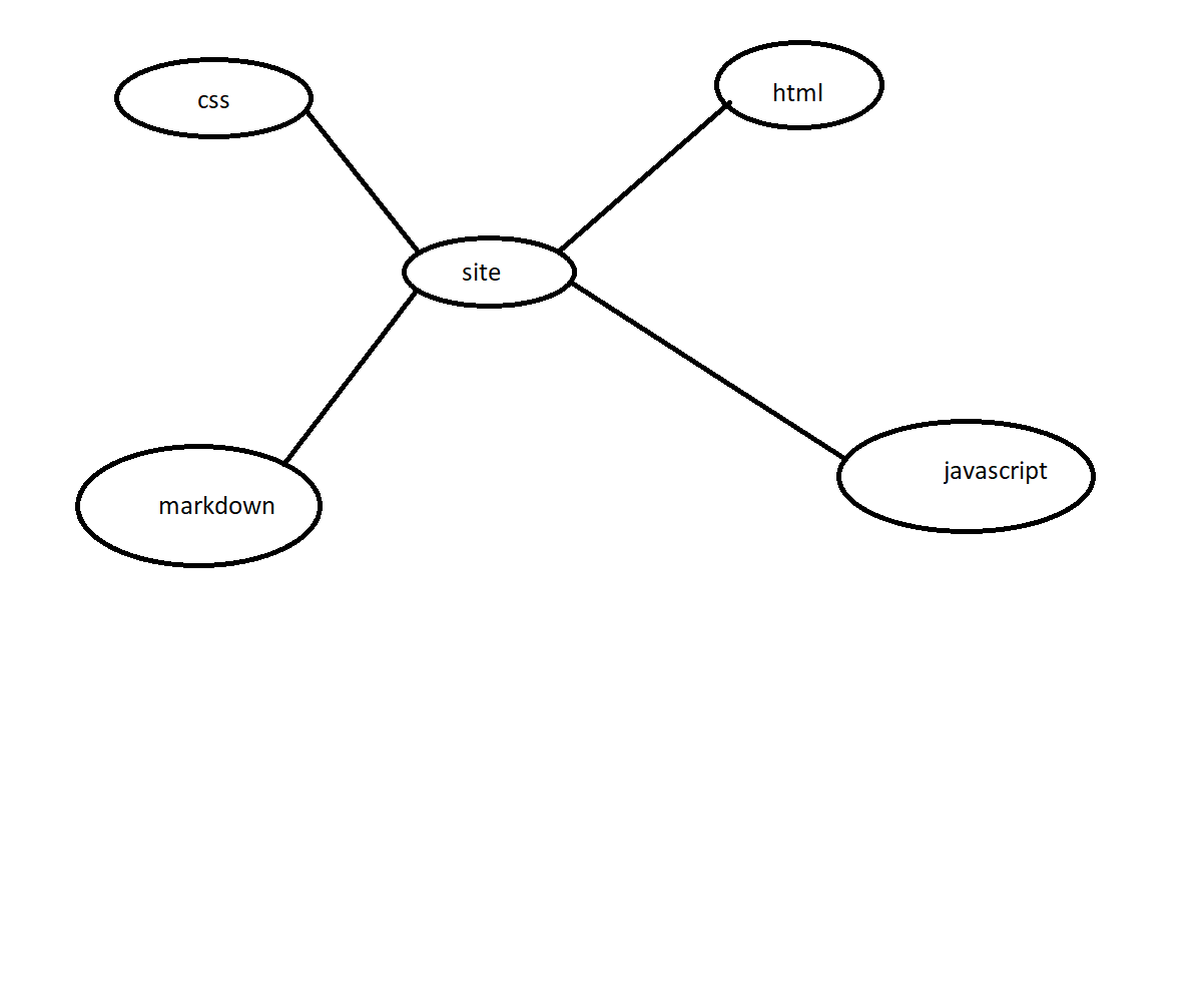
this map for our info :
this a quiz for you :
use the images in your page.
Remember :
- FOUCS
- no pain no gain
- work hard
find more :
| concepts | link |
|---|---|
| HTML Chapter 1: “Structure” | Structure |
| HTML Chapter 8: “Extra Markup” | ExtraMarkup |
| HTML Chapter 17: “HTML5 Layout” | Layout |
| HTML Chapter 18: “Process & Design” | Process & Design |
| JS Chapter 1: “The ABC of Programming” | The ABC of Programming |
| Cheats sheet | Cheats sheet |
link for the github file : gitfile
writen by OBADA ALHAWJREH.
My name is obada jaber, I’m 27 years old, I studied Mechanical engineering and i graduated from al balqa applied university, i am now a software student. OBADA ALHAWJREH.
Support or Contact:
Having trouble with Pages? Check out our : email or phone number : 0781912474 or contact support for gethub and we’ll help you sort it out. 🚑 🚑 🚑